CV in 1-min
Time & audience attention are both constrained. How can I show my past few years in 60 seconds? Perhaps you ran into the same problem as I did. I made a time plot to put in the slides. To reproduce this graph, you need ONLY Google Drive.
The code behind is Python-based, but I already did my best to keep coding requirement down to none. It has also been tested with my friends with no coding experience. So, don’t worry, follow the guide step-by-step, you will get your nice CV-in-graph in 5 minutes!

An example done with my CV
Step 1: Download the folder in this link

Step 2: Go to your google drive > My Drive: make a new folder, name it “Time_plot”
Step 3: Upload the downloaded files to your new folder “Time_plot”
Step 4: Edit “input.xlsx” directly on google drive to your past few years
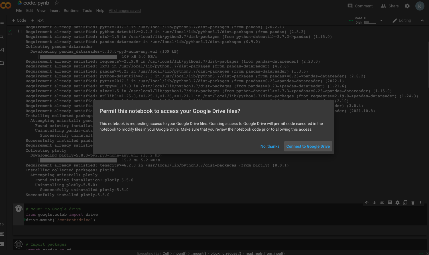
Step 5: Install Google Colab on your browser (only if you never used it before) link

Step 6: Open “code.ipynb” in "Time_plot" folder
Step 7: Go to "Runtime" and simply "Run all"

Step 8: You will run into some permission prompt, "Connect" "Yes" "Allow" etc.
*Do remember to select the same google account where you put the "Time_plot" folder!

Step 9: You should see the graph 1) within the code 2) also in the "Time_plot" folder as "output.png"


Final Output:

Ta-da!
Step (EXTRA): Adjust the bar(s) colour on the third block of code as the screenshot below:
# Set the colors yourself with named CSS or HEX
 colors = {'Study':'#761137',
           'Work':'#283350',
           'Other':'#ff9933'}
Individual colour codes can be found on this free website; a bundle of colours mix-and-match on this website
